WCAG Accessibility 4: Fixing Colour Contrast & Visual Accessibility Issues
In the previous post, we focused on improving form accessibility, addressing issues such as missing labels and placeholder misuse.
In this post, we turn our attention to colour contrast and how it impacts readability and usability across the Rainbows Ireland website.
Read WCAG Accessibility 3: Fixing Form Accessibility Issues
In this fourth post in our WCAG accessibility series, we focus on one of the most common — and most overlooked — accessibility issues: colour contrast.
While colour choices are often driven by branding and design preferences, insufficient contrast can make content difficult or impossible to read for many users, including those with visual impairments or colour vision deficiencies.
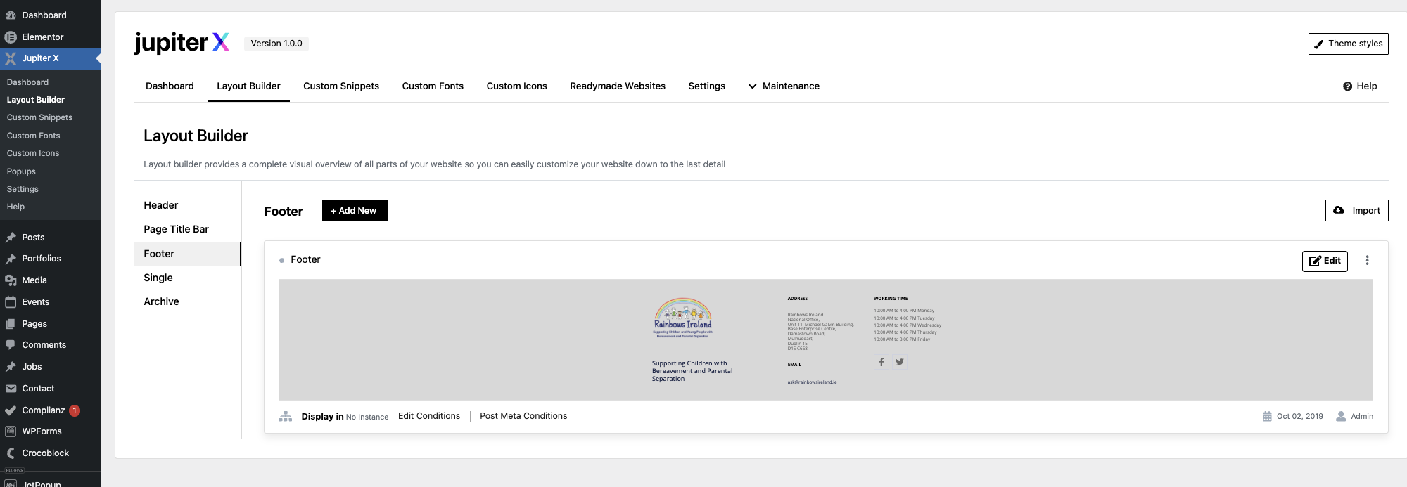
As part of our accessibility improvements for the Rainbows Ireland website, we carried out a full review of colour contrast across key pages and components.
Why Colour Contrast Matters
WCAG 2.2 Level AA requires that:
- Normal text has a contrast ratio of at least 4.5:1
- Large text (18pt+ or 14pt bold) has a contrast ratio of at least 3:1
Without sufficient contrast, users may struggle to read text, identify links, or navigate content effectively.
Issues Identified on the Rainbows Website
Using tools such as WAVE and manual inspection, we identified several contrast-related issues:
- Light grey text on white backgrounds
- Buttons with insufficient contrast against their background
- Links that relied on colour alone for identification
- Hover states that reduced contrast instead of improving it
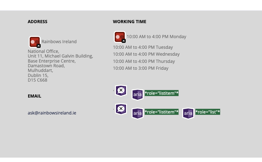
The image above highlights colour contrast issues identified using the WAVE accessibility tool.
Examples of Problem Areas
Several elements across the site did not meet minimum contrast requirements, particularly within:
- Call-to-action buttons
- Form labels and placeholders
- Footer links
- Secondary navigation elements
How We Fixed the Issues
We implemented a number of targeted improvements to ensure compliance while maintaining the overall design aesthetic.
1. Adjusting Text Colours
We replaced low-contrast text colours with darker, more accessible alternatives that meet WCAG AA requirements.
The example above shows improved contrast between text and background, enhancing readability.
2. Improving Button Visibility
Buttons were updated to ensure sufficient contrast between text and background, as well as stronger visual distinction from surrounding elements.
3. Enhancing Link Accessibility
Links were updated to ensure they are not identified by colour alone. This included:
- Adding underlines to links
- Improving contrast ratios
- Ensuring clear hover and focus states
4. Fixing Hover and Focus States
We ensured that hover and focus states improve visibility rather than reduce it, supporting both mouse and keyboard users.
Tools Used
To identify and validate contrast issues, we used:
- WAVE Accessibility Tool
- Browser developer tools
- Manual contrast checking
Key Takeaways
- Colour contrast is essential for readability and usability
- Design should never override accessibility requirements
- Small colour changes can have a significant impact
- Accessibility improvements can enhance the overall user experience
Next Steps
In the next post, we’ll explore how we improved keyboard navigation and focus management across the site.